Latest Update:
Importance and Value of Brand Consistency for Brands

Growth Manager

Brand consistency means presenting your company the same recognizable way everywhere people meet it. Same identity on your website, your deck, your ads, your product, and your support inbox. It does not mean every asset looks identical. It means the things that make you recognizable stay put while everything else adapts to where it lives.
TL;DR
Brand consistency is about being recognized, not about everything matching.
It works because people build memory through repetition. Change the signals and you reset the clock.
Five things carry a brand: visual identity, messaging, voice and tone, templates and assets, and the experience you deliver.
Brand is not the logo, it's everything that you put out; from the billboard, the social media post.
Guidelines alone will not hold a brand together. Templates and a quarterly look at real data will.
What is brand consistency?
Brand consistency is the practice of showing up the same way across every place a customer encounters you.
That covers what people see, like your logo, colors, and typography. What you say, like the problem you solve and how you describe it. And what people get, like the quality of your product and how your team handles a support request at 11pm.
Think about Nike. You see the swoosh on a shoe, a billboard, or a tiny app icon, and you know who it is before reading a word. Repetition did that, not the logo.
Now picture the opposite. You walk into your usual coffee shop and the sign is a different color, the cups have changed shape, and the person at the counter greets you like a call center. Nothing is broken. It just does not feel like the same place.
Why does brand consistency matter?
Consistency does three useful things at once.
It makes you recognizable.
People do not study your brand. They glimpse it, in a feed, in a search result, on a slide someone forwarded. Recognition comes from seeing the same small set of signals over and over until they stick.
The Ehrenberg-Bass Institute calls these distinctive brand assets. Professor Jenni Romaniuk defines a good one by two tests: it is unique, meaning it brings only your brand to mind, and it is famous, meaning people who see it think of you. Her warning is blunt. Inconsistency in colors, fonts, and logos works against the memory you are trying to build.
It builds trust.
A company that looks put together on the website and scrappy in the sales deck reads as a company that is not quite sure of itself. Nobody says this out loud. They feel it, usually right when they are deciding whether to sign.
It saves your team time.
This is the benefit nobody writes about and the one growth-stage teams feel most. Once it is settled which colors, which typefaces, which phrases, and which templates, people stop asking. They stop booking a review to approve a LinkedIn graphic. Done well, consistency is less about control and more about not having the same conversation forty times.
You will also see revenue figures attached to this. The most quoted comes from a Marq survey on brand consistency, where 68% of more than 400 brand managers said consistency had grown revenue by 10% or more. Treat it as sentiment rather than proof. Those are managers estimating, not audited results, and the publisher sells brand management software.
Does consistency make a brand boring?
No, and this is where most brands get it wrong in one of two directions.
Some teams treat the guidelines as a cage, repeating the same layout everywhere until the brand is technically correct and completely lifeless. Others treat every new channel as a fresh start, and end up with a website, a deck, and an Instagram grid that could belong to three different companies.
Google shows the middle path. Doodles are wildly different from one another: hand-drawn, animated, sometimes a whole playable game. Yet you never wonder whose homepage you are on, because one thing never moves, and that is the word itself in its own shape and colors. Everything else is free.
That is the split worth copying.
Keep it fixed | Let it adapt |
|---|---|
Your logo and how it is built | Layout and composition |
Your core color relationships | How much color a given piece uses |
Your typefaces and their roles | Type sizes and hierarchy per format |
The promise you make | How much you explain |
Your voice | Your tone in the moment |
The standard of your product and service | How each channel works |
The same goes for writing, which is the easiest way to remember the whole idea. Your voice is who you are, and it does not change. Your tone is how you sound right now, and it should. You do not announce a funding round and apologize for an outage in the same register.
The five elements of brand consistency
Five things carry a brand. Get these right and the rest follows.
1. Visual identity.
Your logo, color palette, typography, imagery style, icons, and interface patterns. The most visible layer, and the one people usually mean when they say brand.
2. Messaging.
The problem you are known for solving, the promise you make, and the order in which you explain your value. If your homepage, your deck, and your sales calls answer "what do you do" three different ways, the cost is prospects who cannot repeat what you do to their boss.
3. Voice and tone.
Apple is the standard example, deservedly. Plain language, short sentences, no jargon, whether it is a product page or a support article. That consistency is a choice made thousands of times.
4. Templates and assets.
Where guidelines meet reality: a brand kit, a deck template, social sizes, an email layout, and a place everyone can find them. Without these, consistency depends on people remembering rules under deadline, which is not a plan.
5. Experience.
Onboarding, support, invoicing, the follow-up email after a demo. This belongs inside brand consistency rather than beside it, because people judge you on what happened to them, not only on what they saw.
Challenges When Maintaining Branding Consistency
Usually brand guidelines cover the logo, the colors, the type, and a few examples for the website and social. Good document.
Then sales needs a 40-slide deck by Thursday. Recruiting needs a post for a job post. There is a conference in three weeks and someone has to design a ten-foot banner. Marketing orders hoodies. None of that is in the document, so people improvise, and each improvisation quietly becomes the precedent the next person copies.
Six months later nothing has been violated and the company looks like four companies.
Marq's survey found 85% of organizations have brand guidelines and only 30% enforce them consistently. That sounds like a compliance failure and usually is not. Most of the time the guidelines never specify the proper direction.
So the question is not who ignored the rules. It is which format nobody ever decided about.
How do you keep a brand consistent as you grow?
Write down what is genuinely non-negotiable, and keep it to a page.
A short list people read beats a sixty-page manual nobody opens. Run each element through Romaniuk's two tests: is it unique to us, and do people already connect it to us? Protect those. The rest can move.
Decide the awkward formats before you need them.
List everything the company produced last quarter, including what never makes it into a brand book. Conference backdrops. Hiring posts. Merch. Print. Anything without an answer is where your brand breaks next.
Give people starting points, not rules.
The highest-leverage move here. A deck template, an editable social set, an email layout, and a shared folder do more than any policy, because they make the on-brand version the fastest version. People do not go off-brand out of rebellion. They go off-brand because it is 6pm and there is no template.
Look at real output every quarter.
Not the guidelines, the actual work: the live site, the last five decks, recent ads, the emails that went out. Find what has drifted, then fix the template rather than the single asset, or the drift returns.
Change slowly and on purpose.
Tropicana redesigned its packaging in 2009 and dropped the orange with the straw from the front. Shoppers stopped recognizing the carton. The old design was back within a month, with the Ehrenberg-Bass Institute putting the estimated cost at $26.3 million in lost sales. Refreshing a brand is fine. Discarding the part people recognize is the expensive mistake.
Story: Archil's Brand Identity

Archil builds a cloud file system for AI applications. The company came to Zyner early, before there was much of a brand to speak of, to build one from the logo up.
They arrived knowing how they wanted to be seen. Developer infrastructure tends to converge on one look, and Archil wanted the brand to look retro, but minimal.
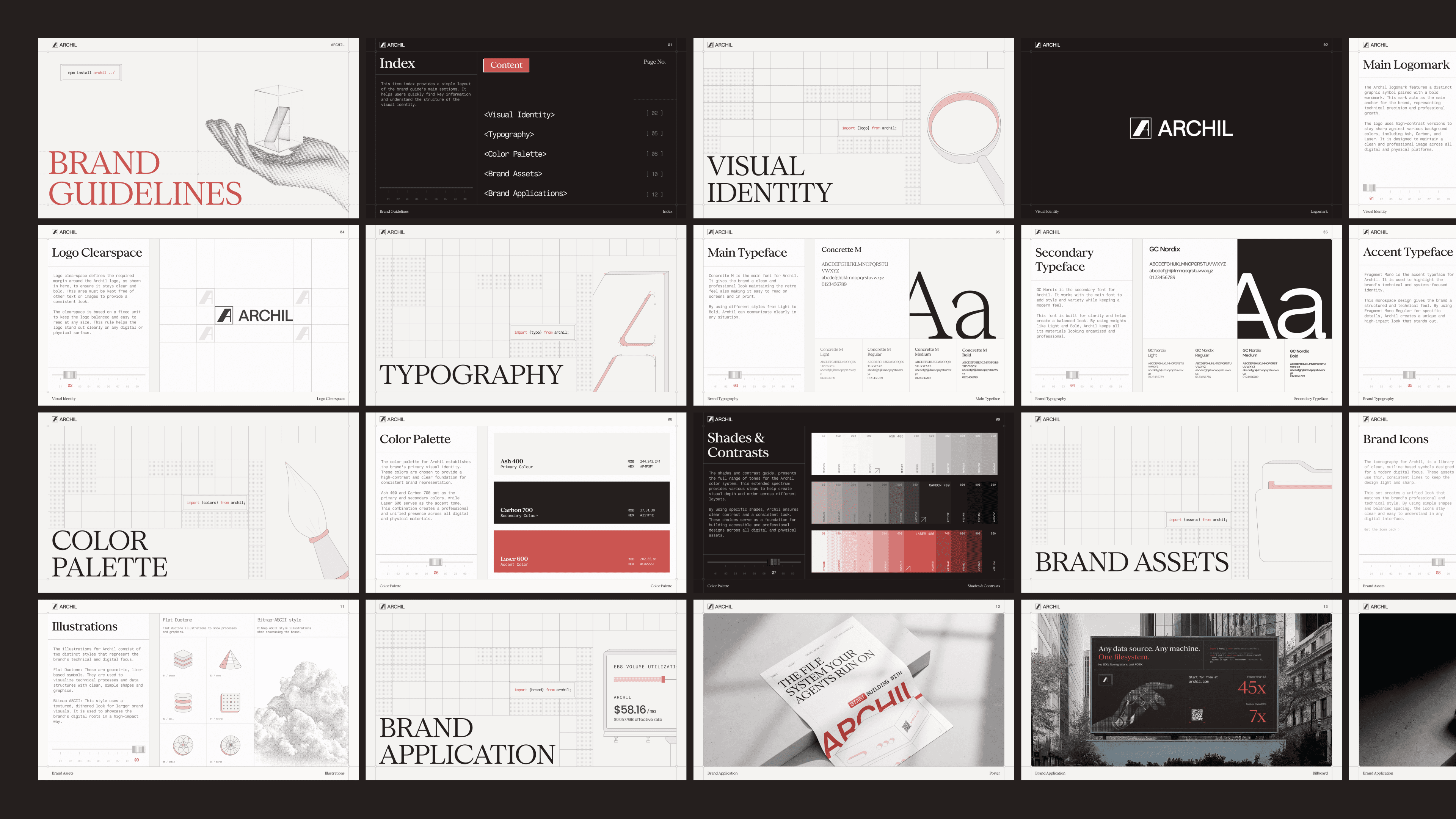
So we build their brand from ground up. A creative direction is easy to describe in a sentence and easy to lose in practice, because every new format is a chance to quietly reinterpret it. So it was built out across a website, a pitch deck, social covers, event graphics, merch, business cards, posters, and print-ready billboards anything and everything that they needed.
Three things about that pay off over the years rather than at launch.
The brand is not built on what they sell.
The identity carries character, not product. That matters most early, because what you sell in a year may not be what you sell today. A brand built on the product gets wiped by a pivot and you start over with nobody knowing you. A brand built on who you are follows you to the new thing.
Everything they make now lands in the same pile.
A deck, a job post, a conference banner, a launch graphic. When those all point the same way, three years of output stacks into one impression. When they do not, each piece starts the recognition clock over and three years leaves you with nothing to show.
They can keep building without coming back.
We built a system they can hand off to any team in the world what we built and they would be able to build on top of it,A system its owners cannot extend stops being a system the first time they need something on short notice.
The full Archil case study covers the work in more detail.
How to navigate a Rebrand?

Swift Ventures is an early-stage venture capital firm, fast and founder-led, and proud of how quickly it works. Nobody asked us to touch the brand. We have never worked with them. Our team spent a month on it anyway, as a concept, because the brand slow and old.
The usual answer to that is a full reset. New logo, new everything. It throws away the parts people already recognize you by, which is the Tropicana mistake wearing a different suit.
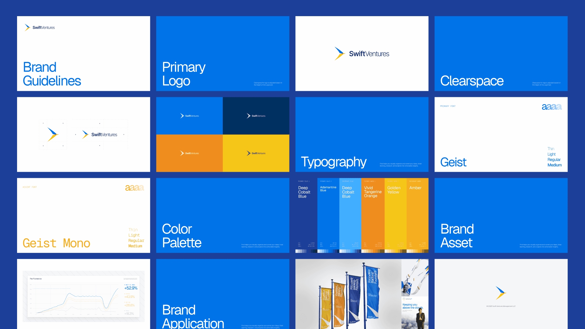
So the exploration ran on one rule: keep anything people use to recognize them.
Keep the recognizable parts and sharpen them.
The triangle in the existing logo stayed, redrawn as a swift in flight. Same silhouette people already knew, with movement it did not have before. Blue and yellow stayed too, with their roles recalibrated so the palette had more contrast and more control.
Replace only what could belong to anyone.
Typography changed most, moving to Geist and Geist Mono, because the old typeface could have sat on any firm in the category. That is the test worth running on every element: is this ours, or is it just the category's?
Carry the same thinking into the experience.
On the website concept we simplified everything, so founders gets their answers in one scroll instead of hunting through pages, which is the brand's own promise of speed showing up.
It was a great experience for our team exploring how to navigate a rebrand when a brand already has recognition.
Read full case study on Swift VC Concept.
Frequently asked questions
How do I audit my brand consistency?
Gather everything a customer could have seen last quarter, group it by format, and check each item against your non-negotiable list. Note which formats had no template. Those gaps matter more than any single mistake.
How often should brand guidelines be updated?
Look at them quarterly and update when a new channel or format appears. Change the core recognizable elements rarely, because every change resets the recognition you have built.
Who should own brand consistency in a startup?
One person with the authority to make the final call, usually the marketing lead. Production can be shared. The decision cannot, or the standard drifts toward whoever is most insistent.
Does brand consistency mean I can never rebrand?
No. It means changing deliberately and keeping whatever people already recognize. Refreshes go wrong when recognizable elements get dropped for reasons of taste.
How long does it take to build a consistent brand?
The core identity is usually a matter of weeks. Covering all your formats takes longer, since it depends on how many you produce. Decks, print, merch, and event assets are typically the last to get solved and the first to fall apart.