

Concept for
Swift Ventures
Industry
Venture Capital
Timeline
1 month

ABOUT PROJECT
A founder-led investment firm needed an identity that could express the speed, judgment, and ambition behind its positioning.

The Challenge
The existing identity was recognizable, but it did not fully express the confidence and momentum behind Swift’s founder-led position.
The opportunity was not to invent a different firm. It was to make the existing story sharper, more ownable, and easier to carry from a first website visit into presentations, social content, and real-world applications.
Refresh without erasing familiarity
The existing mark and blue-and-yellow palette already gave the brand useful recognition. Any change had to preserve that equity while giving the system more intent.
Turn a positioning line into an experience
“Founders Backing Founders” was already a strong message. The identity and website needed to support it with clearer proof, stronger hierarchy, and a more direct path to the people and companies behind the firm.
Create one system for very different surfaces
The refreshed identity had to remain coherent across a website, decks, social posts, outdoor media, events, and merchandise.

Brand Direction
Keep the founder DNA. Modernize the expression.
The research phase examined Swift’s existing identity, digital presence, comparative positioning, and the visual patterns common across venture capital. That review pointed to a clear direction: preserve the firm’s founder-led credibility while making its expression more precise, intelligent, fast, future-facing, and trustworthy.
Those principles became a filter for every later decision. They kept the refresh rooted in what Swift already stood for while giving the team a practical standard for judging the mark, palette, typography, imagery, and website.


Visual Identity
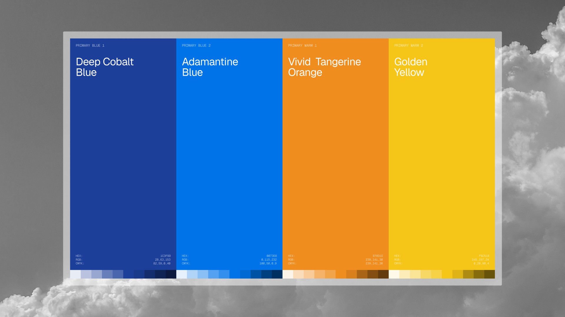
Stronger contrast gave the familiar palette more energy and control.
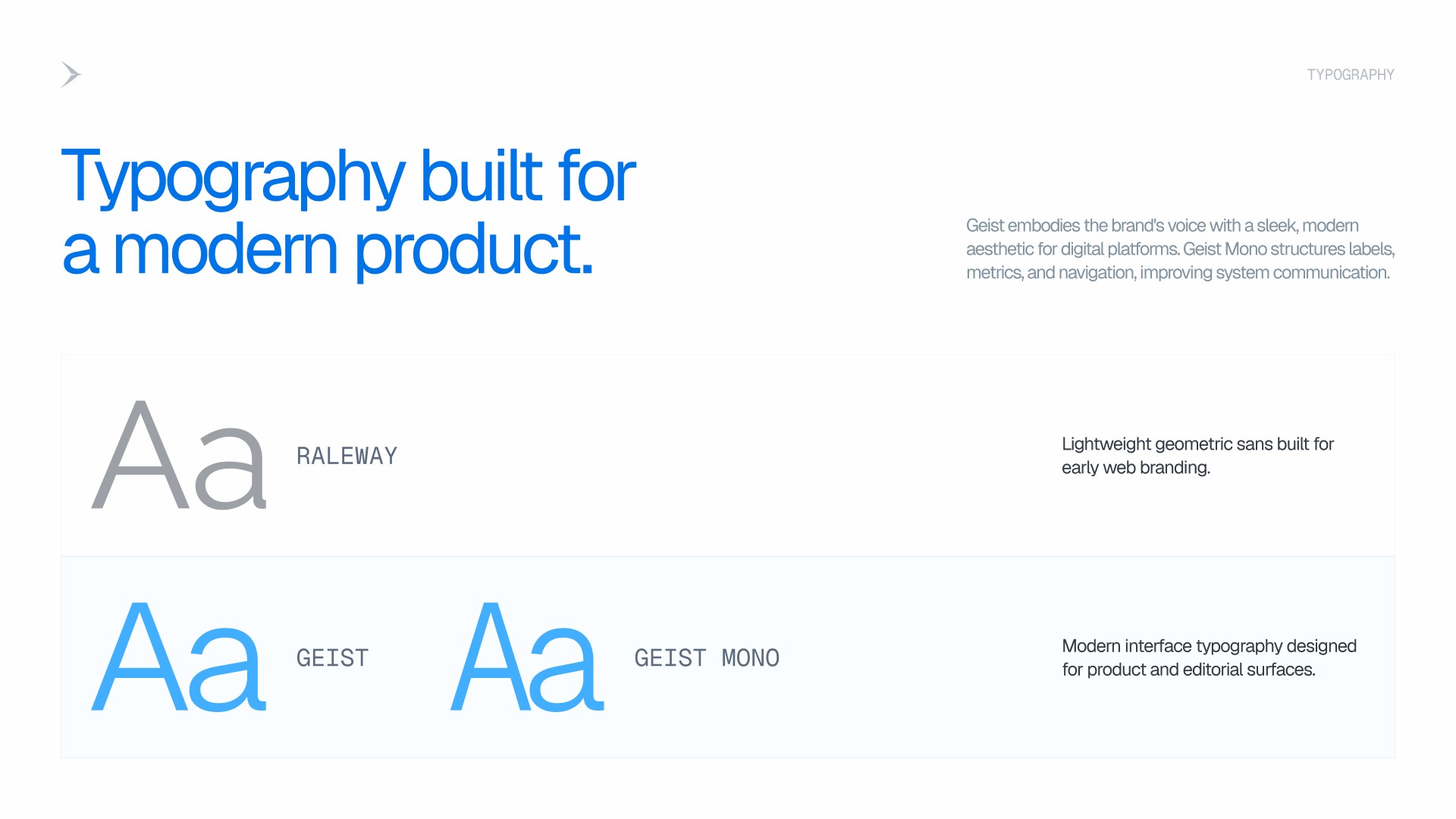
The refresh retained blue, yellow, and warm accents, but recalibrated their roles. Adamantine Blue and Deep Cobalt Blue bring structure and contrast. Vivid Tangerine Orange and Golden Yellow preserve the optimism of the original identity and introduce moments of emphasis.
Geist replaced the more general corporate feel of the previous typography with a clearer interface voice. Geist Mono gives metrics, labels, and data-led content a distinct secondary register. Together, the color and type systems can move from dense digital screens to campaign headlines without losing recognition.

Logo Refresh
A swift in motion turned the existing triangle into a more purposeful symbol.
The logo exploration tested type, proportions, spacing, alignment, and small-screen performance while keeping the original brand recognizable. The final concept draws its silhouette from a swift in flight. Sharper wings introduce movement and momentum, while the underlying triangular geometry keeps the mark connected to its source.
The result is an evolution rather than a replacement: a more energetic symbol paired with a clearer wordmark, designed to hold together across website navigation, presentations, social assets, and physical applications.


Website Concept
The website reorganized the firm around the questions founders ask first.
The concept kept “Founders Backing Founders” at the center of the hero, then reduced the primary navigation to About, Companies, Team, AI Index, and a direct contact action. The aim was to make Swift’s position clear quickly and help visitors move from the promise to supporting proof without digging through the site.
The homepage and supporting pages were structured around four practical paths:
A preview of eight portfolio companies, with short hover context and a categorized directory for the full portfolio
An AI Index section led by one performance view, with a clear route to the full set of metrics
A four-card story timeline that compresses key moments without losing chronology
Direct paths to team profiles and a contact-focused footer with locations, email, and the motion mark


The Result
A clearer expression of Swift’s founder-led position
The concept connects Swift’s central promise to the mark, language, page hierarchy, and campaign system. It shows how the firm could become more distinctive while retaining the familiarity of its original identity.
A faster path from positioning to proof
By placing the portfolio, AI Index, story, and team directly behind the hero message, the website concept helps founders move from what Swift says to the evidence they need to understand the firm.
A visual system designed to travel
The same mark, typography, color logic, and motion cues hold together across the website, social stories, presentations, outdoor media, events, and merchandise. That gives the concept a coherent operating system rather than a single polished landing page.
Book a Call
Let's get Started.
Full creative department on a Flat monthly rate.