
Archil is a cloud filesystem built for AI, handling training data, model weights, and agent workloads at scale. Their product is aimed at developers and ML teams who need reliable, fast storage that mounts like a local disk without the usual migration complexity. The design challenge was creating a brand that reads as technically credible to a developer audience while still carrying enough visual weight to stand out in a space dominated by generic SaaS aesthetics.
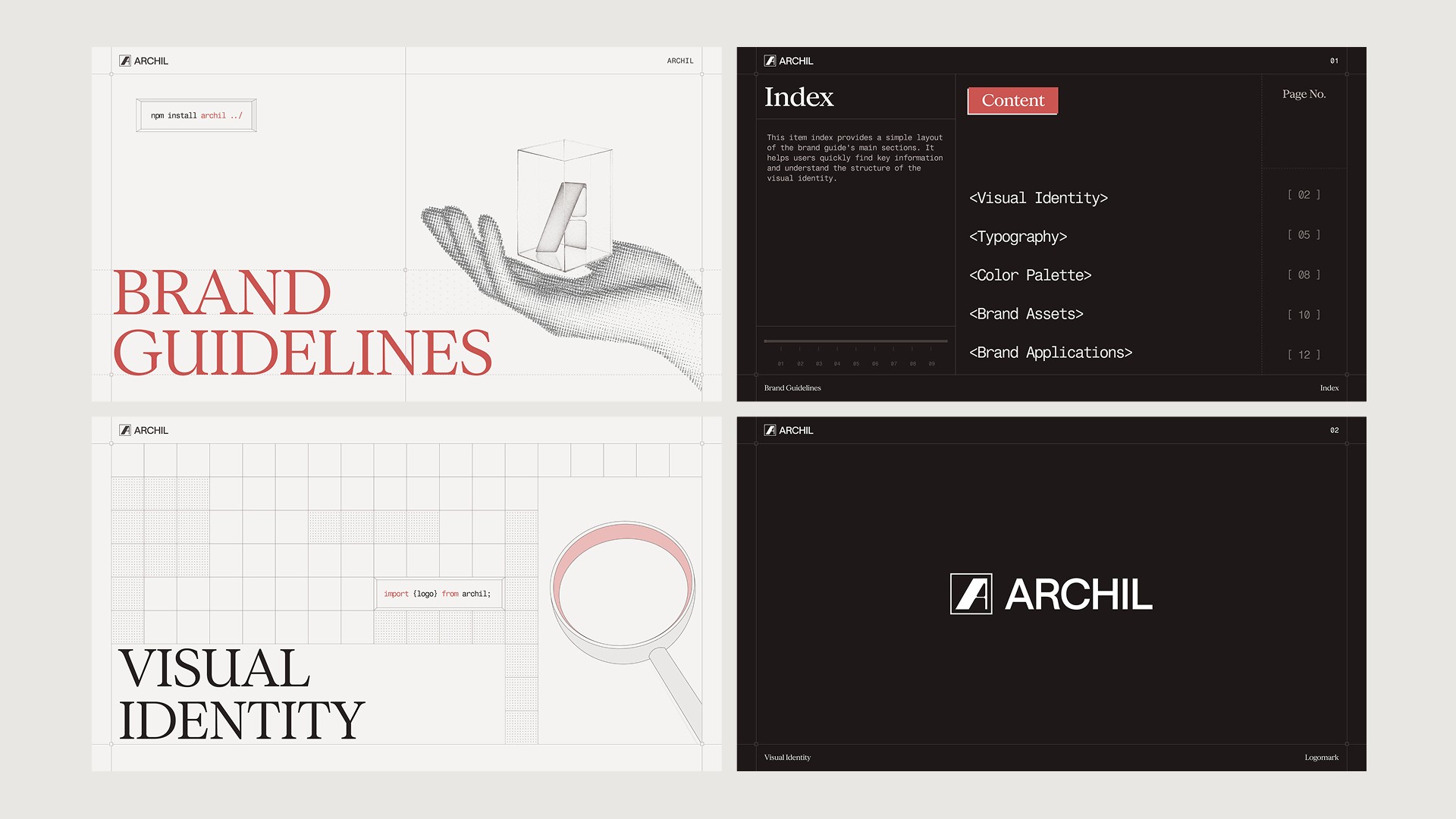
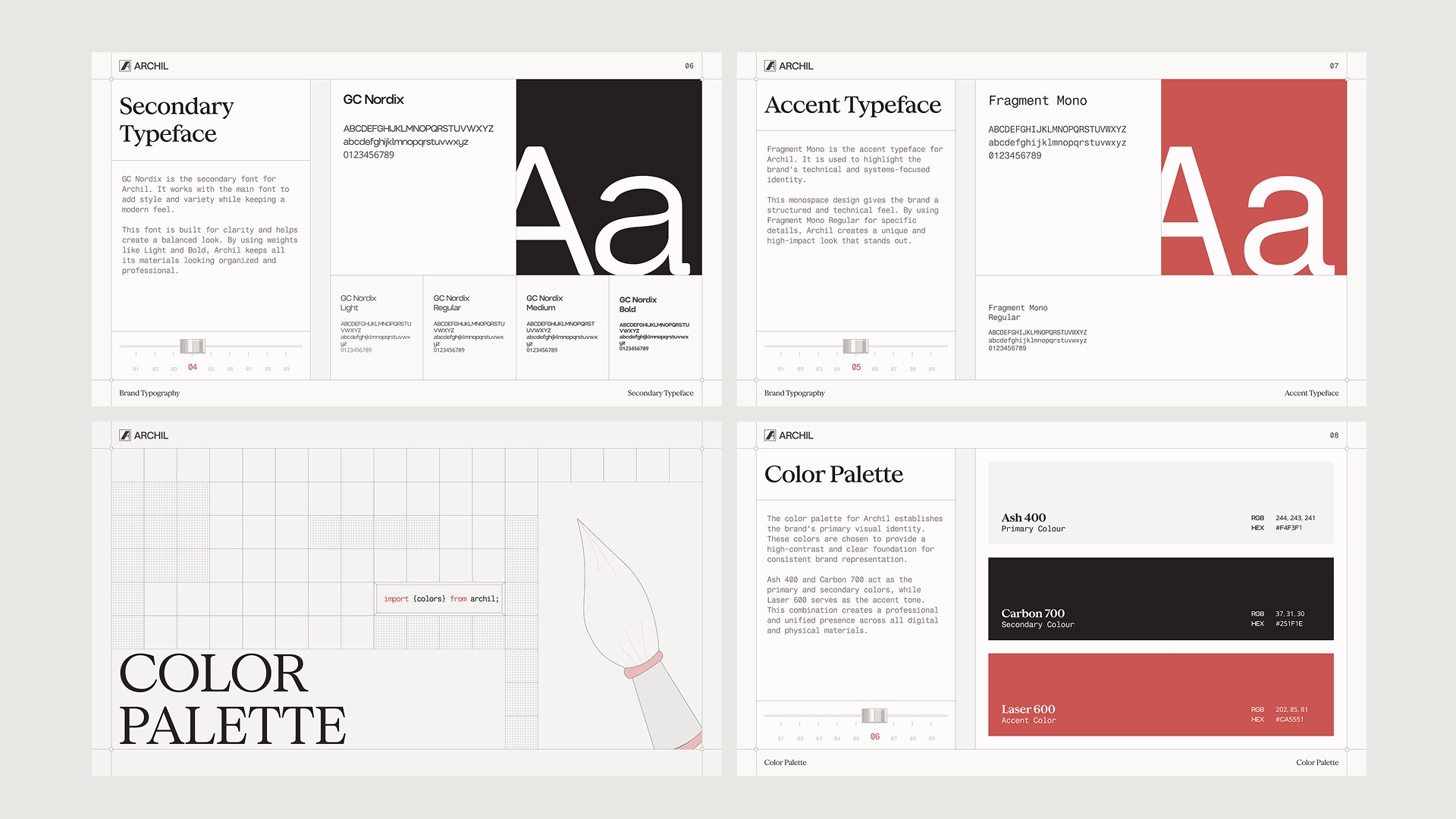
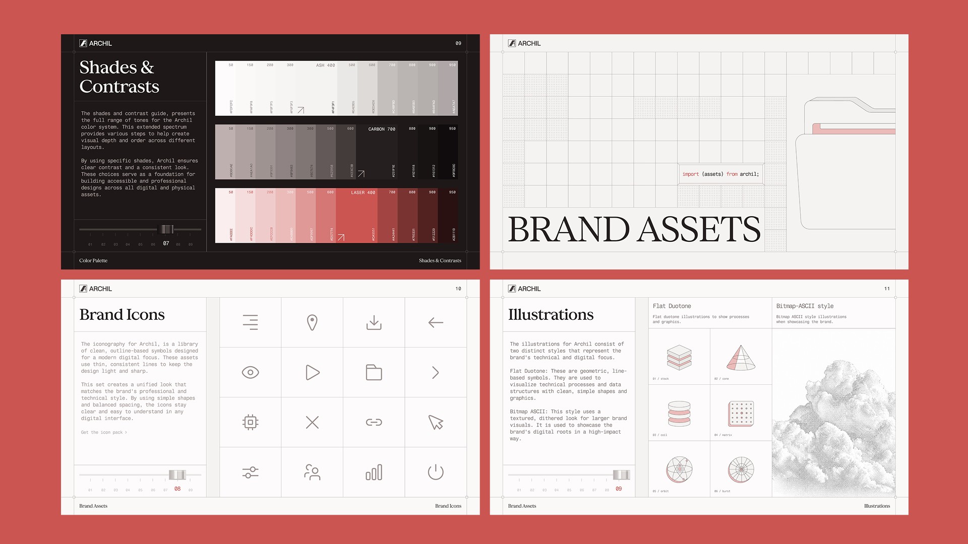
The brand system spans a logomark, a three-typeface stack, a structured color palette, and two distinct illustration styles. The logomark pairs a bold wordmark with a geometric symbol, built to hold up across Ash, Carbon, and Laser color variants. Concrette M anchors the primary typographic voice with a clean, retro-professional feel, supported by GC Nordix for secondary text and Fragment Mono for technical callouts. The color palette keeps Ash 400 and Carbon 700 as the primary and secondary tones, with Laser 600 as the accent. Illustrations follow two modes: flat duotone for process diagrams and Bitmap-ASCII for larger brand visuals, giving the identity range without losing coherence.
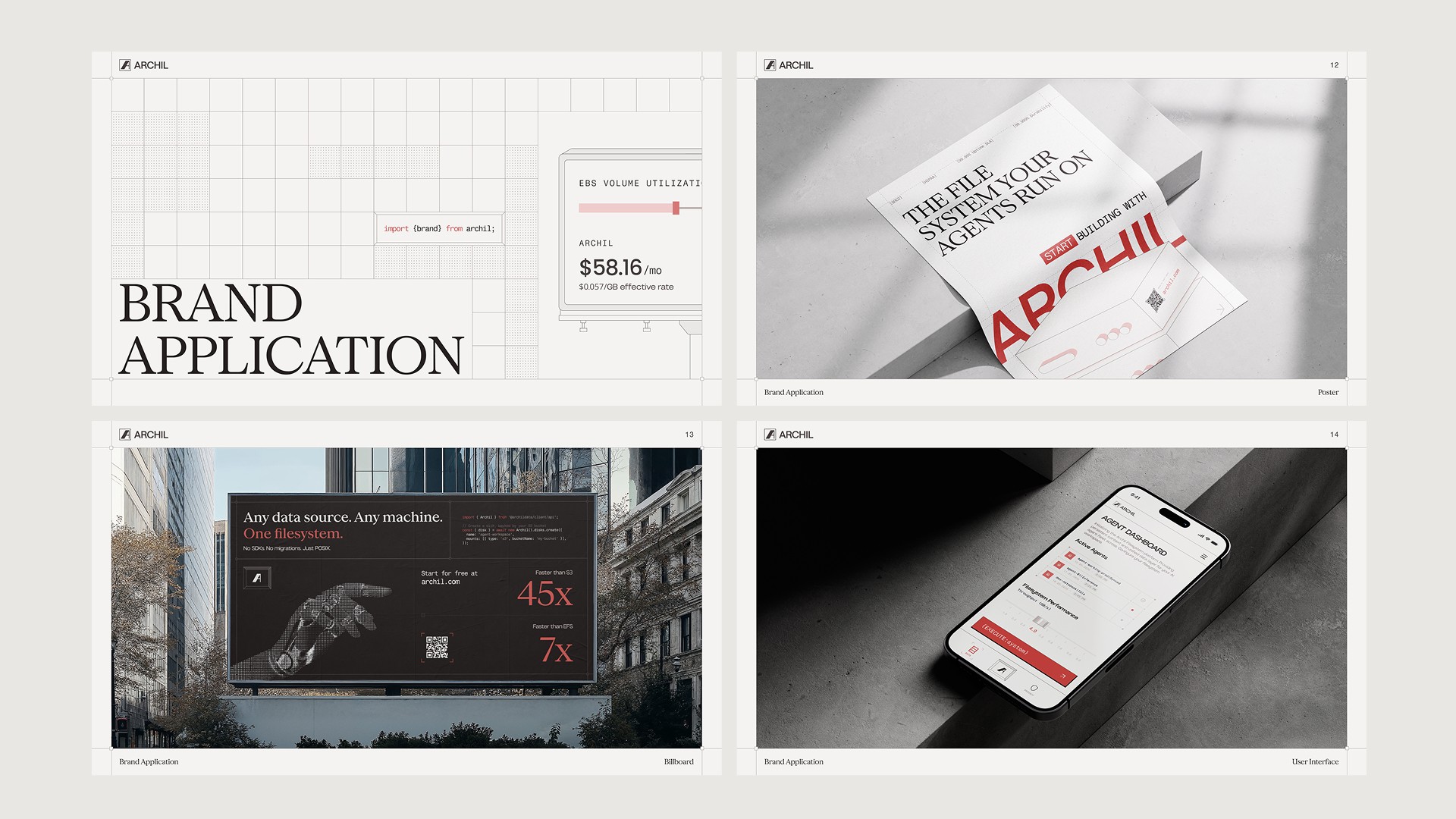
The result is a brand that carries the seriousness of infrastructure tooling without looking like a commodity product. It works across physical and digital surfaces, from developer documentation to billboard placements, with a consistent voice throughout.
If you need a brand identity built for a technical product that has to resonate with a developer audience, book a call with us today.
