Case study
Redesigning PearVC's website to position it as a founder partner
Client
Archil
Industry
AI
"The team nailed the vibe we were going for, with a lot more polish than we expected."

Hunter Leath
Founder & CEO @Archil
Timeline
5 months
Stage
Series A
Case study
Redesigning PearVC's website to position it as a founder partner
Client
Archil
Industry
AI
"The team nailed the vibe we were going for, with a lot more polish than we expected."
Hunter Leath
Founder & CEO @Archil
Timeline
5 months
Stage
Series A
Case study
Redesigning PearVC's website to position it as a founder partner
Client
Archil
Industry
AI
"The team nailed the vibe we were going for, with a lot more polish than we expected."
Hunter Leath
Founder & CEO @Archil
Timeline
5 months
Stage
Series A
About Project
A cloud file system for AI
Archil's technology makes data available across machines and AI workloads. The company approached us with an existing logo, a few assets and a preference for a retro, minimal direction.
What began as a logo refresh expanded over five months into website design, technical presentations and wider brand materials. The assignment became a full identity that could introduce the company and support the detail of its product.
About Project
A cloud file system for AI
Archil's technology makes data available across machines and AI workloads. The company approached us with an existing logo, a few assets and a preference for a retro, minimal direction.
What began as a logo refresh expanded over five months into website design, technical presentations and wider brand materials. The assignment became a full identity that could introduce the company and support the detail of its product.
About Project
A cloud file system for AI
Archil's technology makes data available across machines and AI workloads. The company approached us with an existing logo, a few assets and a preference for a retro, minimal direction.
What began as a logo refresh expanded over five months into website design, technical presentations and wider brand materials. The assignment became a full identity that could introduce the company and support the detail of its product.

Challenge
Retro character at technical depth
The direction had to work beyond the logo. Archil wanted to see how a retro mark would translate into a landing page before judging the wider brand.
We explored that context alongside the identity, considering typography and imagery as part of the same decision. The brand needed room for an expressive introduction, then a quieter structure for product explanations. That range became central to how we developed the system.
Challenge
Retro character at technical depth
The direction had to work beyond the logo. Archil wanted to see how a retro mark would translate into a landing page before judging the wider brand.
We explored that context alongside the identity, considering typography and imagery as part of the same decision. The brand needed room for an expressive introduction, then a quieter structure for product explanations. That range became central to how we developed the system.
Challenge
Retro character at technical depth
The direction had to work beyond the logo. Archil wanted to see how a retro mark would translate into a landing page before judging the wider brand.
We explored that context alongside the identity, considering typography and imagery as part of the same decision. The brand needed room for an expressive introduction, then a quieter structure for product explanations. That range became central to how we developed the system.
Challenge
Retro character at technical depth
The direction had to work beyond the logo. Archil wanted to see how a retro mark would translate into a landing page before judging the wider brand.
We explored that context alongside the identity, considering typography and imagery as part of the same decision. The brand needed room for an expressive introduction, then a quieter structure for product explanations. That range became central to how we developed the system.

Logo exploration
Finding a shape for the identity
We explored several ways to express Archil through a symbol. Some directions used repeated lines and layered forms. Others used bolder geometric symbols and more compact forms.
The variations gave us different relationships between the symbol and the name. Across the rounds, we explored the construction of the A, its surrounding shape and the weight of the wordmark. The later directions also placed the identity into sample compositions, showing how it could extend beyond the logo itself.
Logo exploration
Finding a shape for the identity
We explored several ways to express Archil through a symbol. Some directions used repeated lines and layered forms. Others used bolder geometric symbols and more compact forms.
The variations gave us different relationships between the symbol and the name. Across the rounds, we explored the construction of the A, its surrounding shape and the weight of the wordmark. The later directions also placed the identity into sample compositions, showing how it could extend beyond the logo itself.
Logo exploration
Finding a shape for the identity
We explored several ways to express Archil through a symbol. Some directions used repeated lines and layered forms. Others used bolder geometric symbols and more compact forms.
The variations gave us different relationships between the symbol and the name. Across the rounds, we explored the construction of the A, its surrounding shape and the weight of the wordmark. The later directions also placed the identity into sample compositions, showing how it could extend beyond the logo itself.
Logo exploration
Finding a shape for the identity
We explored several ways to express Archil through a symbol. Some directions used repeated lines and layered forms. Others used bolder geometric symbols and more compact forms.
The variations gave us different relationships between the symbol and the name. Across the rounds, we explored the construction of the A, its surrounding shape and the weight of the wordmark. The later directions also placed the identity into sample compositions, showing how it could extend beyond the logo itself.

Font exploration
Comparing the character of the type
We presented different type treatments alongside the mark, using brand compositions to show how each pairing changed the identity. The font exploration board brought those options together for comparison.
This part of the work considered the relationship between the logo and the typography around it. The type had to carry a large product statement, then accommodate the smaller labels and explanations that would appear throughout Archil's materials.
Font exploration
Comparing the character of the type
We presented different type treatments alongside the mark, using brand compositions to show how each pairing changed the identity. The font exploration board brought those options together for comparison.
This part of the work considered the relationship between the logo and the typography around it. The type had to carry a large product statement, then accommodate the smaller labels and explanations that would appear throughout Archil's materials.
Font exploration
Comparing the character of the type
We presented different type treatments alongside the mark, using brand compositions to show how each pairing changed the identity. The font exploration board brought those options together for comparison.
This part of the work considered the relationship between the logo and the typography around it. The type had to carry a large product statement, then accommodate the smaller labels and explanations that would appear throughout Archil's materials.

Colour exploration
Seeing the directions through colour
The early boards explored purple, teal and blue alongside monochrome and warmer red treatments. Each palette appeared with a logo, typography and imagery, so the colour could be considered as part of the wider direction.
Showing those combinations together made their differences visible. Cooler palettes, grayscale compositions and red-led alternatives each gave the same product a different visual character. The exploration also included light and dark applications, which became part of the finished identity.
Colour exploration
Seeing the directions through colour
The early boards explored purple, teal and blue alongside monochrome and warmer red treatments. Each palette appeared with a logo, typography and imagery, so the colour could be considered as part of the wider direction.
Showing those combinations together made their differences visible. Cooler palettes, grayscale compositions and red-led alternatives each gave the same product a different visual character. The exploration also included light and dark applications, which became part of the finished identity.
Colour exploration
Seeing the directions through colour
The early boards explored purple, teal and blue alongside monochrome and warmer red treatments. Each palette appeared with a logo, typography and imagery, so the colour could be considered as part of the wider direction.
Showing those combinations together made their differences visible. Cooler palettes, grayscale compositions and red-led alternatives each gave the same product a different visual character. The exploration also included light and dark applications, which became part of the finished identity.

Final branding
A retro identity rooted in storage
The final identity pairs a slanted A inside a square with a compact ARCHIL wordmark. Warm off-white and deep charcoal establish the base, with muted red providing emphasis. Fine grids and rules give the layouts their structure across light and dark applications.
Concrette M carries the retro character in headlines. GC Nordix provides the supporting sans serif, while Fragment Mono distinguishes technical labels and system details. Each has a defined role as the content moves between a large statement and a detailed explanation.
Storage gives the imagery its recurring subject. Folders, filing drawers and archives connect the retro direction to Archil's product. A wide drawer can carry a billboard composition; a single folder can become the focus of an event graphic.
Final branding
A retro identity rooted in storage
The final identity pairs a slanted A inside a square with a compact ARCHIL wordmark. Warm off-white and deep charcoal establish the base, with muted red providing emphasis. Fine grids and rules give the layouts their structure across light and dark applications.
Concrette M carries the retro character in headlines. GC Nordix provides the supporting sans serif, while Fragment Mono distinguishes technical labels and system details. Each has a defined role as the content moves between a large statement and a detailed explanation.
Storage gives the imagery its recurring subject. Folders, filing drawers and archives connect the retro direction to Archil's product. A wide drawer can carry a billboard composition; a single folder can become the focus of an event graphic.
Final branding
A retro identity rooted in storage
The final identity pairs a slanted A inside a square with a compact ARCHIL wordmark. Warm off-white and deep charcoal establish the base, with muted red providing emphasis. Fine grids and rules give the layouts their structure across light and dark applications.
Concrette M carries the retro character in headlines. GC Nordix provides the supporting sans serif, while Fragment Mono distinguishes technical labels and system details. Each has a defined role as the content moves between a large statement and a detailed explanation.
Storage gives the imagery its recurring subject. Folders, filing drawers and archives connect the retro direction to Archil's product. A wide drawer can carry a billboard composition; a single folder can become the focus of an event graphic.
Website exploration
The file system comes first
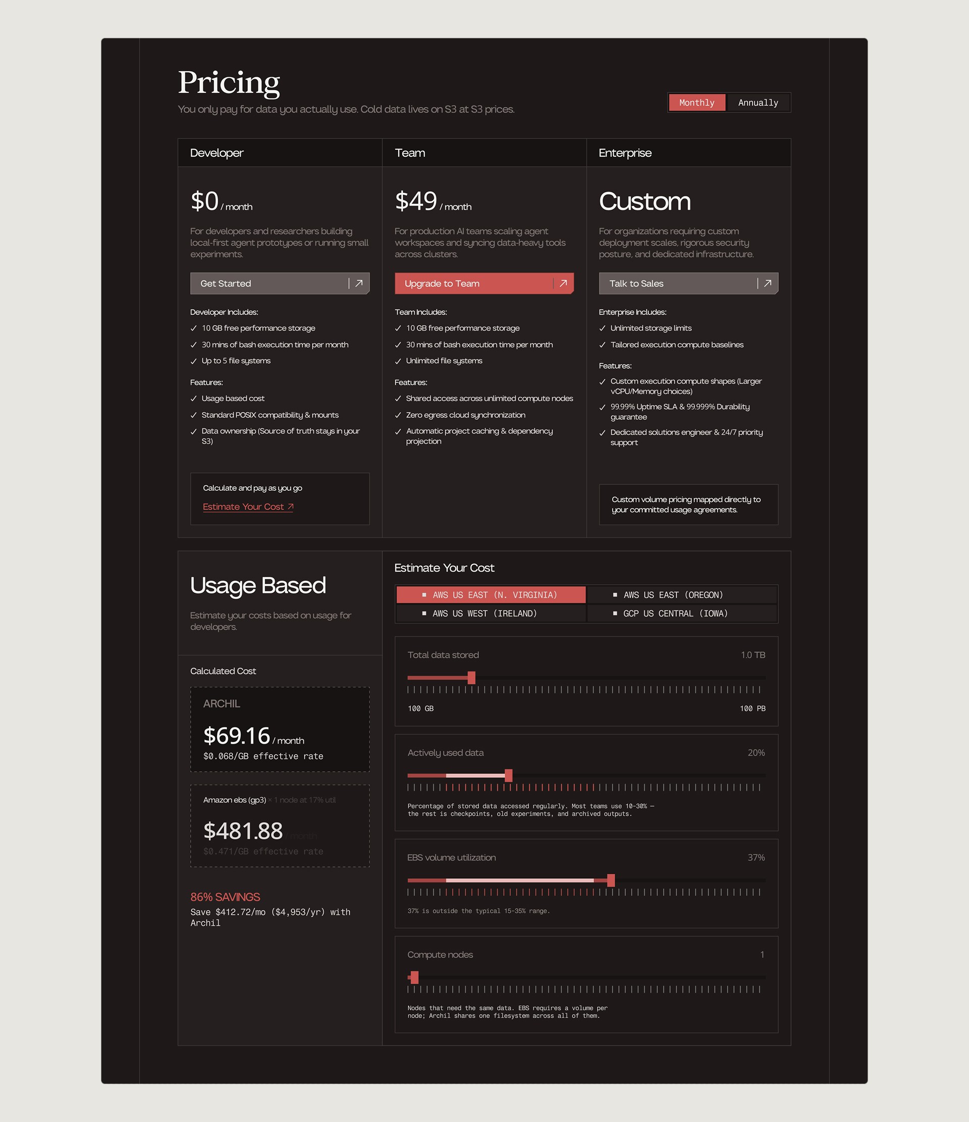
The website gave the identity a different set of demands. A brand composition can focus on one image or statement. A product page has to introduce the offer, explain how it works and give visitors a way to continue.
We explored that balance through several website versions, developing light and dark treatments alongside variations in buttons and individual sections. The large serif headlines, fine grids and textured imagery carried through, with simpler layouts around the more detailed content.
The iterations also exposed places where the imagery needed to be more explicit. One illustration intended to represent a data centre prompted a question about what it showed. We revised it in the next version. The product explanation needed images whose meaning could be understood in context.
The website work extended into pricing, about and blog page designs. These carried the same visual language into pages with different amounts and types of information.
Website exploration
The file system comes first
The website gave the identity a different set of demands. A brand composition can focus on one image or statement. A product page has to introduce the offer, explain how it works and give visitors a way to continue.
We explored that balance through several website versions, developing light and dark treatments alongside variations in buttons and individual sections. The large serif headlines, fine grids and textured imagery carried through, with simpler layouts around the more detailed content.
The iterations also exposed places where the imagery needed to be more explicit. One illustration intended to represent a data centre prompted a question about what it showed. We revised it in the next version. The product explanation needed images whose meaning could be understood in context.
The website work extended into pricing, about and blog page designs. These carried the same visual language into pages with different amounts and types of information.
Website exploration
The file system comes first
The website gave the identity a different set of demands. A brand composition can focus on one image or statement. A product page has to introduce the offer, explain how it works and give visitors a way to continue.
We explored that balance through several website versions, developing light and dark treatments alongside variations in buttons and individual sections. The large serif headlines, fine grids and textured imagery carried through, with simpler layouts around the more detailed content.
The iterations also exposed places where the imagery needed to be more explicit. One illustration intended to represent a data centre prompted a question about what it showed. We revised it in the next version. The product explanation needed images whose meaning could be understood in context.
The website work extended into pricing, about and blog page designs. These carried the same visual language into pages with different amounts and types of information.


Website hierarchy
The file system comes first
The website gave the identity a different set of demands. A brand composition can focus on one image or statement. A product page has to introduce the offer, explain how it works and give visitors a way to continue.
We explored that balance through several website versions, developing light and dark treatments alongside variations in buttons and individual sections. The large serif headlines, fine grids and textured imagery carried through, with simpler layouts around the more detailed content.
The iterations also exposed places where the imagery needed to be more explicit. One illustration intended to represent a data centre prompted a question about what it showed. We revised it in the next version. The product explanation needed images whose meaning could be understood in context.
The website work extended into pricing, about and blog page designs. These carried the same visual language into pages with different amounts and types of information.
Website hierarchy
The file system comes first
The website gave the identity a different set of demands. A brand composition can focus on one image or statement. A product page has to introduce the offer, explain how it works and give visitors a way to continue.
We explored that balance through several website versions, developing light and dark treatments alongside variations in buttons and individual sections. The large serif headlines, fine grids and textured imagery carried through, with simpler layouts around the more detailed content.
The iterations also exposed places where the imagery needed to be more explicit. One illustration intended to represent a data centre prompted a question about what it showed. We revised it in the next version. The product explanation needed images whose meaning could be understood in context.
The website work extended into pricing, about and blog page designs. These carried the same visual language into pages with different amounts and types of information.
Website hierarchy
The file system comes first
The website gave the identity a different set of demands. A brand composition can focus on one image or statement. A product page has to introduce the offer, explain how it works and give visitors a way to continue.
We explored that balance through several website versions, developing light and dark treatments alongside variations in buttons and individual sections. The large serif headlines, fine grids and textured imagery carried through, with simpler layouts around the more detailed content.
The iterations also exposed places where the imagery needed to be more explicit. One illustration intended to represent a data centre prompted a question about what it showed. We revised it in the next version. The product explanation needed images whose meaning could be understood in context.
The website work extended into pricing, about and blog page designs. These carried the same visual language into pages with different amounts and types of information.


Product comparison
The file system comes first
The website gave the identity a different set of demands. A brand composition can focus on one image or statement. A product page has to introduce the offer, explain how it works and give visitors a way to continue.
We explored that balance through several website versions, developing light and dark treatments alongside variations in buttons and individual sections. The large serif headlines, fine grids and textured imagery carried through, with simpler layouts around the more detailed content.
The iterations also exposed places where the imagery needed to be more explicit. One illustration intended to represent a data centre prompted a question about what it showed. We revised it in the next version. The product explanation needed images whose meaning could be understood in context.
The website work extended into pricing, about and blog page designs. These carried the same visual language into pages with different amounts and types of information.
Product comparison
The file system comes first
The website gave the identity a different set of demands. A brand composition can focus on one image or statement. A product page has to introduce the offer, explain how it works and give visitors a way to continue.
We explored that balance through several website versions, developing light and dark treatments alongside variations in buttons and individual sections. The large serif headlines, fine grids and textured imagery carried through, with simpler layouts around the more detailed content.
The iterations also exposed places where the imagery needed to be more explicit. One illustration intended to represent a data centre prompted a question about what it showed. We revised it in the next version. The product explanation needed images whose meaning could be understood in context.
The website work extended into pricing, about and blog page designs. These carried the same visual language into pages with different amounts and types of information.
Product comparison
The file system comes first
The website gave the identity a different set of demands. A brand composition can focus on one image or statement. A product page has to introduce the offer, explain how it works and give visitors a way to continue.
We explored that balance through several website versions, developing light and dark treatments alongside variations in buttons and individual sections. The large serif headlines, fine grids and textured imagery carried through, with simpler layouts around the more detailed content.
The iterations also exposed places where the imagery needed to be more explicit. One illustration intended to represent a data centre prompted a question about what it showed. We revised it in the next version. The product explanation needed images whose meaning could be understood in context.
The website work extended into pricing, about and blog page designs. These carried the same visual language into pages with different amounts and types of information.
Presentations
The connections are part of the explanation
The presentation moves deeper into the product. Across 27 redesigned slides, the material covers architecture, deployment options and application use cases, alongside comparisons and charts. The identity needed to support that density without obscuring the technical relationships.
The shared-architecture diagram offers a specific example. It separates the customer's cloud account from Archil's, placing the relevant components within each boundary. Application servers, file-system servers and storage servers remain individually labelled, so their positions and responsibilities can be read together.
During review, Archil flagged missing connections between the file-system server and storage servers. Those paths had been left out to avoid a busy diagram, but their absence made the components appear disconnected. We restored the connections in the revised diagrams.
That detail mattered to the explanation. A cleaner-looking diagram still needed to show how the system fits together. The account boundaries organize the architecture; the connectors preserve the relationships within it.
The deck carries the brand through its typography, restrained palette and recurring layout structure. Each slide can give the technical content the space it needs while remaining part of the same presentation.
Presentations
The connections are part of the explanation
The presentation moves deeper into the product. Across 27 redesigned slides, the material covers architecture, deployment options and application use cases, alongside comparisons and charts. The identity needed to support that density without obscuring the technical relationships.
The shared-architecture diagram offers a specific example. It separates the customer's cloud account from Archil's, placing the relevant components within each boundary. Application servers, file-system servers and storage servers remain individually labelled, so their positions and responsibilities can be read together.
During review, Archil flagged missing connections between the file-system server and storage servers. Those paths had been left out to avoid a busy diagram, but their absence made the components appear disconnected. We restored the connections in the revised diagrams.
That detail mattered to the explanation. A cleaner-looking diagram still needed to show how the system fits together. The account boundaries organize the architecture; the connectors preserve the relationships within it.
The deck carries the brand through its typography, restrained palette and recurring layout structure. Each slide can give the technical content the space it needs while remaining part of the same presentation.
Presentations
The connections are part of the explanation
The presentation moves deeper into the product. Across 27 redesigned slides, the material covers architecture, deployment options and application use cases, alongside comparisons and charts. The identity needed to support that density without obscuring the technical relationships.
The shared-architecture diagram offers a specific example. It separates the customer's cloud account from Archil's, placing the relevant components within each boundary. Application servers, file-system servers and storage servers remain individually labelled, so their positions and responsibilities can be read together.
During review, Archil flagged missing connections between the file-system server and storage servers. Those paths had been left out to avoid a busy diagram, but their absence made the components appear disconnected. We restored the connections in the revised diagrams.
That detail mattered to the explanation. A cleaner-looking diagram still needed to show how the system fits together. The account boundaries organize the architecture; the connectors preserve the relationships within it.
The deck carries the brand through its typography, restrained palette and recurring layout structure. Each slide can give the technical content the space it needs while remaining part of the same presentation.
Social and events
Giving each communication its own composition
Social covers and event graphics brought the identity into formats with less room for explanation. The product and company still needed to be recognizable within a single composition.
For LinkedIn and X covers, we explored light and dark treatments around the file-system message. One route uses the simple stack illustration; another gives more space to a textured folder. These draw on the two illustration roles established in the guidelines while keeping the message prominent.
The event work allowed a broader range of subjects. Archil at Night designs use large typography and imagery, while other layouts bring in envelopes, folders and postage-like borders. Those references extend the storage vocabulary into communications associated with invitations and gatherings.
The system provides the recurring elements, while each message determines which of them leads. A cover can centre on the product; an event graphic can give the occasion more personality.
Social and events
Giving each communication its own composition
Social covers and event graphics brought the identity into formats with less room for explanation. The product and company still needed to be recognizable within a single composition.
For LinkedIn and X covers, we explored light and dark treatments around the file-system message. One route uses the simple stack illustration; another gives more space to a textured folder. These draw on the two illustration roles established in the guidelines while keeping the message prominent.
The event work allowed a broader range of subjects. Archil at Night designs use large typography and imagery, while other layouts bring in envelopes, folders and postage-like borders. Those references extend the storage vocabulary into communications associated with invitations and gatherings.
The system provides the recurring elements, while each message determines which of them leads. A cover can centre on the product; an event graphic can give the occasion more personality.
Social and events
Giving each communication its own composition
Social covers and event graphics brought the identity into formats with less room for explanation. The product and company still needed to be recognizable within a single composition.
For LinkedIn and X covers, we explored light and dark treatments around the file-system message. One route uses the simple stack illustration; another gives more space to a textured folder. These draw on the two illustration roles established in the guidelines while keeping the message prominent.
The event work allowed a broader range of subjects. Archil at Night designs use large typography and imagery, while other layouts bring in envelopes, folders and postage-like borders. Those references extend the storage vocabulary into communications associated with invitations and gatherings.
The system provides the recurring elements, while each message determines which of them leads. A cover can centre on the product; an event graphic can give the occasion more personality.


Apparel
Storage history becomes part of the story
The apparel work ranged from simpler logo treatments to graphics built around the product category. Cap designs explored compact arrangements of the identity, while the T-shirts offered more room for an image or idea.
One T-shirt graphic places a floppy disk, a hard drive and a server in sequence, ending with the Archil mark. The line The End of Static Storage gives that sequence its proposition, positioning Archil as the next step in the composition.
Here, the retro reference becomes part of what the artwork says. The familiar devices establish a history of storage, and the final symbol brings the sequence back to the company. The graphic carries a product idea alongside the Archil name.
Other treatments draw on the textured folder imagery and typographic elements of the identity. Together, the directions show how the brand can support both a simple company mark and a larger graphic composition.
Apparel
Storage history becomes part of the story
The apparel work ranged from simpler logo treatments to graphics built around the product category. Cap designs explored compact arrangements of the identity, while the T-shirts offered more room for an image or idea.
One T-shirt graphic places a floppy disk, a hard drive and a server in sequence, ending with the Archil mark. The line The End of Static Storage gives that sequence its proposition, positioning Archil as the next step in the composition.
Here, the retro reference becomes part of what the artwork says. The familiar devices establish a history of storage, and the final symbol brings the sequence back to the company. The graphic carries a product idea alongside the Archil name.
Other treatments draw on the textured folder imagery and typographic elements of the identity. Together, the directions show how the brand can support both a simple company mark and a larger graphic composition.
Apparel
Storage history becomes part of the story
The apparel work ranged from simpler logo treatments to graphics built around the product category. Cap designs explored compact arrangements of the identity, while the T-shirts offered more room for an image or idea.
One T-shirt graphic places a floppy disk, a hard drive and a server in sequence, ending with the Archil mark. The line The End of Static Storage gives that sequence its proposition, positioning Archil as the next step in the composition.
Here, the retro reference becomes part of what the artwork says. The familiar devices establish a history of storage, and the final symbol brings the sequence back to the company. The graphic carries a product idea alongside the Archil name.
Other treatments draw on the textured folder imagery and typographic elements of the identity. Together, the directions show how the brand can support both a simple company mark and a larger graphic composition.


Posters and billboards
Memory and data take a visible form
The larger formats gave the imagery more room. Filing drawers could extend across a horizontal layout, with rows of folders making storage the subject of the entire composition. Vertical designs used a single image and a stronger typographic statement.
Other directions explored associations around memory and computing. An anatomical brain carries Memory for machines. A perspective grid gives form to Data has gravity. A human hand and a mechanical hand bring another relationship into the work, connecting human and machine imagery.
Each composition pairs a specific idea with an image that can carry it. The shared typography and palette hold these different subjects within the same identity, while the scale allows the image or headline to become the main event.
The work included wide billboard layouts and standing-banner designs, with environmental mockups showing how selected compositions could appear at scale.
Posters and billboards
Memory and data take a visible form
The larger formats gave the imagery more room. Filing drawers could extend across a horizontal layout, with rows of folders making storage the subject of the entire composition. Vertical designs used a single image and a stronger typographic statement.
Other directions explored associations around memory and computing. An anatomical brain carries Memory for machines. A perspective grid gives form to Data has gravity. A human hand and a mechanical hand bring another relationship into the work, connecting human and machine imagery.
Each composition pairs a specific idea with an image that can carry it. The shared typography and palette hold these different subjects within the same identity, while the scale allows the image or headline to become the main event.
The work included wide billboard layouts and standing-banner designs, with environmental mockups showing how selected compositions could appear at scale.
Posters and billboards
Memory and data take a visible form
The larger formats gave the imagery more room. Filing drawers could extend across a horizontal layout, with rows of folders making storage the subject of the entire composition. Vertical designs used a single image and a stronger typographic statement.
Other directions explored associations around memory and computing. An anatomical brain carries Memory for machines. A perspective grid gives form to Data has gravity. A human hand and a mechanical hand bring another relationship into the work, connecting human and machine imagery.
Each composition pairs a specific idea with an image that can carry it. The shared typography and palette hold these different subjects within the same identity, while the scale allows the image or headline to become the main event.
The work included wide billboard layouts and standing-banner designs, with environmental mockups showing how selected compositions could appear at scale.


Result
A brand that reflects the substance of the product
Archil came to us as an established, funded startup with little beyond a logo to represent it. We built a complete identity around the core ideas of its product, giving the company a visual language rooted in storage, memory and the movement of data.
A consistent identity wherever people encounter Archil
That identity carries through the website, presentations, social media and print materials. Each application serves a different purpose while remaining recognizably Archil, creating continuity between how the company introduces itself and how it explains its technology.
A foundation the team can continue to build on
The work gives Archil a starting point for what comes next. Defined typography, colour, imagery and layout principles provide a shared direction for future communications, allowing the team to extend the brand beyond our engagement without starting over.
Result
A brand that reflects the substance of the product
Archil came to us as an established, funded startup with little beyond a logo to represent it. We built a complete identity around the core ideas of its product, giving the company a visual language rooted in storage, memory and the movement of data.
A consistent identity wherever people encounter Archil
That identity carries through the website, presentations, social media and print materials. Each application serves a different purpose while remaining recognizably Archil, creating continuity between how the company introduces itself and how it explains its technology.
A foundation the team can continue to build on
The work gives Archil a starting point for what comes next. Defined typography, colour, imagery and layout principles provide a shared direction for future communications, allowing the team to extend the brand beyond our engagement without starting over.
Result
A brand that reflects the substance of the product
Archil came to us as an established, funded startup with little beyond a logo to represent it. We built a complete identity around the core ideas of its product, giving the company a visual language rooted in storage, memory and the movement of data.
A consistent identity wherever people encounter Archil
That identity carries through the website, presentations, social media and print materials. Each application serves a different purpose while remaining recognizably Archil, creating continuity between how the company introduces itself and how it explains its technology.
A foundation the team can continue to build on
The work gives Archil a starting point for what comes next. Defined typography, colour, imagery and layout principles provide a shared direction for future communications, allowing the team to extend the brand beyond our engagement without starting over.
Book a Call
Tell us what you’re building.
We’ll help you map the right scope, team, timeline, and next steps.
Trusted by Startups & Enterprises Worldwide


Trusted by Startups & Enterprises Worldwide
Trusted by Startups & Enterprises Worldwide
Trusted by Startups & Enterprises Worldwide
All-in-one Design Studio
for Startups and Enterprises
Address
44 Montgomery St, San Francisco,
CA 94104, United States
Dev & Growth
All-in-one Design Studio
for Startups and Enterprises
Address
44 Montgomery St, San Francisco,
CA 94104, United States
Dev & Growth
All-in-one Design Studio
for Startups and Enterprises
Address
44 Montgomery St, San Francisco,
CA 94104, United States
Dev & Growth
